Next.js 프로젝트에서 모달을 효율적으로 관리하고 재사용 가능한 시스템을 구축하기 위해 Zustand를 사용하여 전역 상태 관리 와 커스텀 훅을 통한 편리한 모달 호출 인터페이스 를 작성하였습니다.
▪︎ 주요 기능
전역 모달 상태 관리 ( Zustand )
텍스트 하이라이팅 기능
아이콘 커스터마이징
확인/취소 버튼 커스터마이징
콜백함수 지원
▪︎ 구현 상세 ▫︎ Modal Store zustand를 사용하여 모달의 상태를 전역적으로 관리하였습니다. 텍스트 하이라이팅, 아이콘, 버튼 텍스트, 콜백 함수 등 다양한 커스터마이징 옵션 제공이 가능합니다.
1 2 3 4 5 6 7 8 9 10 11 12 13 14 15 16 17 18 19 20 21 22 23 24 25 26 27 28 29 30 31 32 33 34 35 36 37 38 39 40 41 42 43 44 45 46 interface TextHighlight { range : { start : number ; end : number ; }; color : string ; } interface ModalState { isOpen : boolean ; icon?: ComponentType ; title : string ; titleHighlight?: TextHighlight ; message : string ; messageHighlight?: TextHighlight ; confirmText : string ; cancelText?: string ; onConfirm?: () => void ; onCancel?: () => void ; } interface ModalStore { modal : ModalState ; openModal : (modal: Partial<ModalState> ) => void ; closeModal : () => void ; } const initialState : ModalState = { isOpen : false , title : "" , message : "" , confirmText : "확인" , }; const useModalStore = create<ModalStore >((set ) => ({ modal : initialState, openModal : (modal ) => set ((state ) => ({ modal : { ...state.modal , ...modal, isOpen : true }, })), closeModal : () => set ({ modal : initialState }), })); export { useModalStore, type TextHighlight };
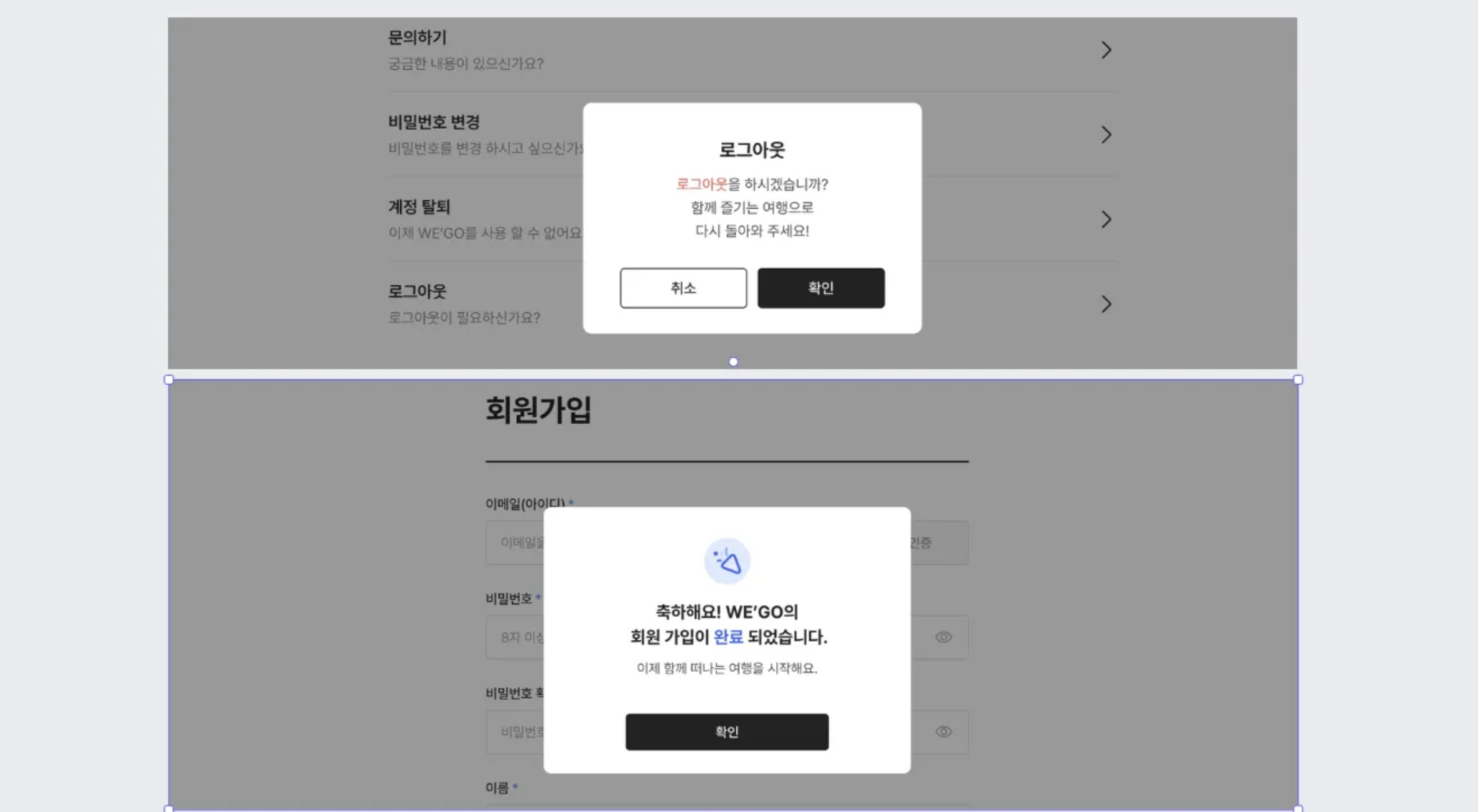
▫︎ Modal Component 실제 화면에 그려질 컴포넌트입니다. 텍스트 하이라이팅 기능에 대해 어떻게 구현할지가 최대 고민거리였습니다.
위 이미지처럼 Title과 message 들 중 텍스트에 색상으로 하이라이트가 들어가 있는 경우가 있었습니다. 어떤 식으로 인자를 받아야 해당 부분을 구현할 수 있을까 고민하다 하이라이팅 할 텍스트의 시작점과 끝점에 대한 정보와 color 정보를 받아 구현하도록 하였습니다.
1
2
3
4
5
6
7
8
9
10
11
const HighlightedText = ({ text, highlight }: { text: string ; highlight?: TextHighlight } ) => { if (!highlight) return <span className ="whitespace-pre-line" > {text}</span > return ( <span className ="whitespace-pre-line" > {text.slice(0, highlight.range.start)} <span className ={highlight.color} > {text.slice(highlight.range.start, highlight.range.end)}</span > {text.slice(highlight.range.end)} </span > ); };
모달 컴포넌트의 코드는 다음과 같습니다.
1 2 3 4 5 6 7 8 9 10 11 12 13 14 15 16 17 18 19 20 21 22 23 24 25 26 27 28 29 30 31 32 33 34 35 36 37 38 39 40 41 42 43 44 45 46 47 48 49 50 51 52 53 54 55 56 57 58 59 60 61 62 63 64 65 66 67 68 69 70 71 72 73 74 75 76 const Modal = ( const { modal, closeModal } = useModalStore (); const { isOpen, icon : Icon , title, titleHighlight, message, messageHighlight, confirmText = "확인" , cancelText = "취소" , onConfirm, onCancel, } = modal; const handleConfirm = ( if (onConfirm) onConfirm (); closeModal (); }; const handleCancel = ( if (onCancel) onCancel (); closeModal (); }; if (!isOpen) return null ; return ( <div className ="fixed inset-0 z-50 flex animate-fade-in items-center justify-center bg-black/40 pb-[80px]" > <div className ="min-w-[298px] animate-slide-up rounded-lg bg-white p-8 md:min-w-[380px]" > {Icon && ( <div className ="mb-4 flex justify-center" > <div className ="bg-primary-light flex h-16 w-16 items-center justify-center rounded-full" > <Icon /> </div > </div > )} <div className ="text-center" > <h2 className ="title-5-b" > <HighlightedText text ={title} highlight ={titleHighlight} /> </h2 > <p className ="text-body-2-r mt-2 whitespace-pre-line text-label-neutral" > <HighlightedText text ={message} highlight ={messageHighlight} /> </p > </div > <div className ="mt-6 flex w-full justify-center" > {onCancel ? ( <div className ="flex w-[250px] gap-2" > <Button label ={cancelText} size ="full" handler ={handleCancel} fill ="white" className ="h-[38px] w-[120px]" /> <Button label ={confirmText} size ="full" handler ={handleConfirm} className ="h-[38px] w-[120px]" /> </div > ) : ( <Button label ={confirmText} size ="addon" handler ={handleConfirm} className ="h-[38px] w-[120px] md:w-[210px]" /> )} </div > </div > </div > ); }; export default Modal ;
▫︎ Modal Custom Hook 간편한 모달 호출을 위해서 인터페이스를 제공하기 위해 커스텀 훅을 작성해주었습니다. 이제는 어디서든 이 커스텀 훅을 필요한 정보와 함께 호출하면 모달 사용이 가능해집니다.
1
2
3
4
5
6
7
8
9
10
11
12
13
14
15
16
17
18
19
20
21
22
23
24
25
26
27
28
interface ModalOptions { icon?: ComponentType <SVGProps <SVGElement >>; titleHighlight?: TextHighlight ; messageHighlight?: TextHighlight ; confirmText?: string ; cancelText?: string ; onConfirm?: () => void ; onCancel?: () => void ; } const useModal = ( const { openModal, closeModal } = useModalStore (); const showModal = (title: string , message: string , options?: ModalOptions ) => { openModal ({ title, message, ...options, }); }; return { showModal, closeModal, }; }; export default useModal;
▪︎ 사용 예시 프로젝트 내 동일한 형식의 모달이 필요한 곳에서는 모달 커스텀 훅을 호출하여 편리하게 사용이 가능했습니다. 예시 코드는 TanstackQuery의 useMutation 훅으로 작성된 회원가입 api 가 성공했을 시, 모달이 보여지게 동작합니다.
1 2 3 4 5 6 7 8 9 10 11 12 13 14 15 16 17 18 19 20 21 22 23 24 25 26 27 28 29 30 31 32 33 34 35 36 37 38 39 40 41 42 43 44 const useSignup = ( const router = useRouter (); const { showModal } = useModal (); return useMutation ({ mutationFn : signup, onError : (error: QueryError ) => { switch (error.status ) { case 500 : showModal ("네트워크를 확인해주세요." , "회원가입에 실패했습니다." , { icon : ModalErrorIcon , confirmText : "돌아가기" , messageHighlight : { range : { start : 6 , end : 8 }, color : "text-status-error" , }, onConfirm : () => { router.push ("/login" ); }, }); break ; case 400 : break ; default : } }, onSuccess : () => { showModal ("축하해요! WE'GO의\n회원가입이 완료 되었습니다." , "이제 함께 떠나는 여행을 시작해요." , { icon : ModalSuccessIcon , confirmText : "확인" , titleHighlight : { range : { start : 19 , end : 21 }, color : "text-primary-normal" , }, onConfirm : () => { router.push ("/" ); }, }); }, }); };
▪︎ 구현 방식의 장점 1. 재사용성 프로젝트 전체에서 일관된 모달 UI/UX 제공
2. 타입 안정성 TypeScript를 활용한 완벽한 타입 지원
3. 커스터마이징 다양한 옵션으로 상황에 맞는 모달 구성 가능
4. 사용 편의성 간단한 인터페이스로 복잡한 모달 구현 가능
▪︎ 마치며 Zustand와 Custom Hook을 활용하여 재사용 가능하고 타입 안전한 모달 시스템을 구축했습니다. 이를 통해 프로젝트의 일관성을 유지하면서도 다양한 상황에 대응할 수 있는 유연한 모달 구현이 가능했습니다.